

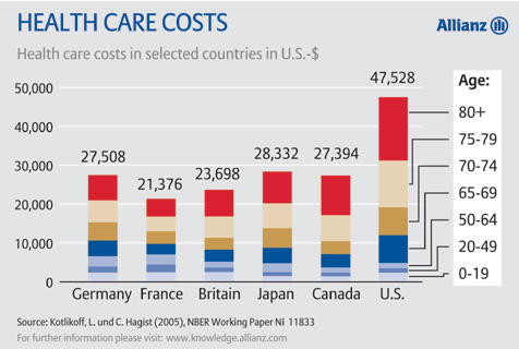
The conventional story is that the US was horrendously inefficient, much more so than other countries. While that may be true, these graphs make it appear that it's more likely that we spend far more on elderly care than other countries. For those under age 60, we don't seem much more inefficient than other countries. These graphs make it appear that it is not inefficiency, but choices on how much to spend on elder-care, that make our per-capita health care expenses more than other countries. (Note - these graphs are from pre-Obamacare data.)

No comments:
Post a Comment